4 tips for designing well optimized content-heavy pages for the web
Designing your webpage is an essential part of any business operation. It’s what makes you approachable and easier to find, and it’s also the first place where your customers will be looking for information about you. That being said, a well-optimized site packed with useful information goes a long way. It’s easy to optimize a site which doesn’t have a lot to say, but the real challenge comes when your page is content heavy. Luckily, there are a few useful tips to help you make a coherent webpage.
1. Come up with a plan for your page
In order to end up with a coherent and elegant page, you’ll need to brainstorm a lot first. Every great idea needs a plan in order to be executed properly. This primarily implies thinking of your layout. There are many ways you can organize your page, some more useful for heavy content pages than others.
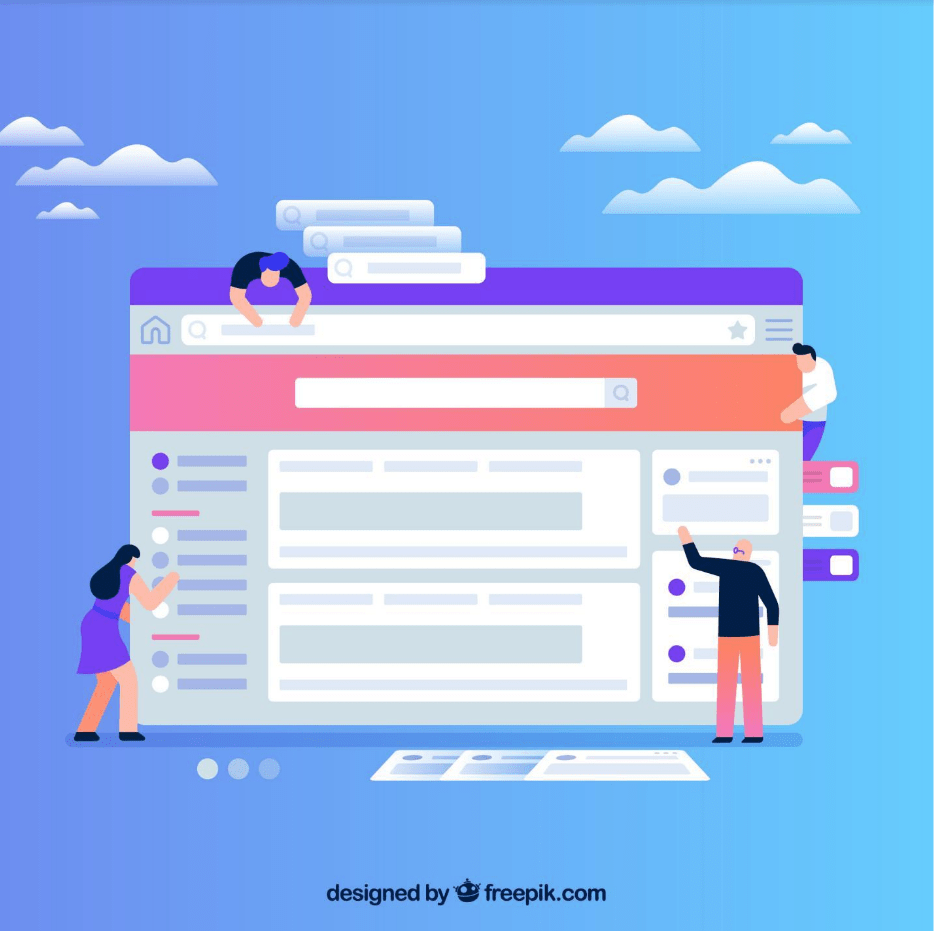
For example, you can create navigational tabs. This kind of design offers a classic and neat look which packs all of your information in different tabs. That way, the page will appear minimalistic until the customer clicks on the desired tab. Once they do, they’ll receive all the relevant information they need.
If you want to be more creative, you can try adding image sliders or carousels. They work much the same way as navigational tabs do but are more modern and fun.
2. Choose relevant artwork
They say a picture says a thousand words, and even though it may sound like a cliché, there is some truth to the statement. Choosing and adding relevant artwork and pictures to your webpage will come a long way.
That’s why it’s very smart to divide up your content with photos related to it. This is bound to catch the user’s attention, as the visual draws our attention more easily. In fact, sites which do this are often user favorites. You can further customize your webpage if you hand-draw animations and images relevant to your content.
Adding photos is a very subtle way to introduce all that information you have stored on your site. Nobody likes to be bombarded with pieces of information as soon as they open a webpage.
Whatever you decide, remember that photos are something which enriches your site profoundly.
3. Remember: less is more
This is an important tip because even though you want your site to be interesting and user-friendly, you don’t want to go overboard. Adding too many images and animations, or having too many navigational tabs is just going to make your site more confusing.
That’s why you can’t forget to have a main structure. You need to stick to it no matter what you do on your site. Don’t put everything up on the main page. Instead, try to make titles with short subtitles which elaborate on the titles a little. This will direct your user to the information they need while keeping your webpage clean.
4. Add different types of interesting content
You could always stick with the classic text design accompanied by relevant photographs, but there are some other possibilities if you want to create a really interesting and unique website. For instance, you can replace some of the text with videos. We’ve already mentioned the effect visual aids have on us, so it’s not a bad idea to use that to your advantage.
What’s more, you could make your site more user-friendly by making it responsive. This means adapting your site to devices such as mobile phones, because, let’s face it, more and more users are using it to browse.
Additionally, you can turn to Bapple Creative who will gladly help you with any sort of design you think of.
Conclusion
Even though it may seem hard, optimizing a webpage for heavy connect isn’t that difficult when you’ve got the right inspiration and ideas. We’re confident that you’ll be able to create the perfect page for your business now that you’re equipped with the right knowledge. A coherent page helps your customers get acquainted with your products further. This is crucial for gaining more traffic. So the more user-friendly your site is, the more customers you’re bound to attract!


