Website Debate: Creativity Driven vs. Marketing Driven?
Creatives and marketers have been long at war in the various realms of product design, graphic design and digital. On the creative side, there’s a bigger focus on delivering something that’s aesthetically appealing and visually unique whilst the marketing side prioritises delivering something that converts and sells effectively. So, the question is: Which is more important? Should a website be creativity driven or marketing driven?
What is a Creativity Driven Website?
A creative approach to web design is driven by visual appeal, imagination, and originality. It looks at harmonising the website by bringing in more adventurous fonts, colours, and multimedia together to curate a website that gives a strong visual experience. Vandelay Design highlights that creativity comes from inspiration and experimentation to come up with innovative and unique solutions. With such explorations, creative-driven websites can be easier on the eyes but harder to use and navigate around.
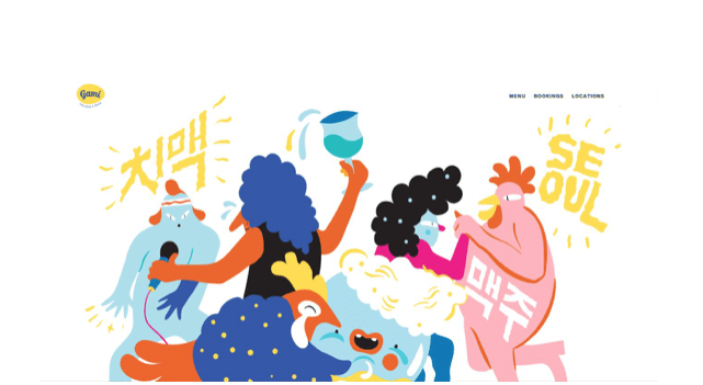
An example of a website with a creative approach is Gami Chicken’s new website. Artistically executed with adventurous vector characters, spread out imagery and artfully disguised CTA buttons, it even transforms the user experience into a little bit of a game. This website might be aimed for a younger target market or those who are a bit more savvy with technology who don’t mind a hunting for the CTAs, a subtle game of hide-and-seek.
Image Source: Gami Chicken & Beer AUS
Whilst the user experience is definitely more engaging, it, in turn, can slightly compromise the marketing effectiveness of the website. What can come with a more unique navigation or hidden CTAs are the increased difficulties for some users to locate these in a straightforward manner. Even in such a technology-driven era, individuals still expect a certain degree of familiarity when navigating a website; for menu items to be located in the top right or for CTA buttons to be housed in a rectangular shape.
What is a Marketing Driven Website?
On the topic of marketing effectiveness, we can then delve into the notion of marketing driven websites. These websites are more geared to a functional approach in designing, with a purpose-built vision to directly achieve a higher conversion in sales, as an example. These websites can tend to look much simpler than creativity driven websites, as they put less focus on the complementary visual assets but instead emphasise the CTAs, for example, a company’s phone number or contact form. Stripping away the bells and whistles of fancy visuals, marketing-driven websites focus more on straightforward and direct user experiences.
In order to get conversions though, traffic is needed first, so marketers are also very search engine optimisation (SEO) orientated. SEO strategies in themselves can also place limitations on design, as some pathways involve the generation of large chunks of content, (which can be an eyesore for users).
Craigslist is an example of a website that plays more heavily in the marketing-driven digital space; it is still one of the top 100 Alexa websites in the world according to Crazy Egg. With clear navigation and headings, it’s easy for users to find what they’re looking for and they’re not distracted by an array of fonts, stylised imagery, backgrounds or colours which a creative vision might demand. When you open Craigslist, everything they have to offer is just there. And if you can’t find the category you’re looking for, there’s also a search bar on the left, making it very easy to find what you’re looking for.
Image Source: Craigslist
The absence of time for creativity in the digital strategy of this website has also dented its real possibility to ‘wow’ users visually. In Crazy Egg’s words, ‘ It is one of the ugliest sites I’ve ever seen”. I’d only really be visiting the site if I needed something, and I’d only be there for that one thing. I wouldn’t stay and check out other things that they might have because the site just isn’t appealing to me.”
However, the website still remains easy to use, and essentially have fulfilled its initial purpose as it gives its users exactly what they may be looking for. Whilst this tug-of-war might make it feel like you can only have one or the other, it is possible to aim for a balance to reap the benefits of both. The strengths of a creative site are often the weaknesses of a marketing driven site and visa versa, so why not have both and flex two muscles? Two arms can lift more than the one. Whilst marketing effectiveness can be crucial to keeping a business alive, visual appeal does also influence the credibility of a website. 46.1% of respondents for a particular survey based on the credibility of a website on its visual design, including elements such as typography, colour scheme, and layout. Without visually attractive elements, only users who know what they’re looking for will be willing to convert. Those who are uncertain or just browsing can be less easily reeled in.
The purpose of creativity should be to draw users in, to capture their attention and get them browsing through the website and not just looking for what they need but also what they may want now or in the future. The purpose of marketing then is to guide users to convert, simplifying navigation and leading users through the decision-making process. With the consumers in mind, marketing grounds creativity, so that while the website is unique and imaginative, the user experience is still kept in mind so that the website is user-friendly and functional for the business. And isn’t that what web design is in a nutshell? The harmonisation of beauty, usability, and functionality so that users have an amazing web experience that leads them to convert?


